Seaborn Barplot Presentation
| Introduction to Seaborn Barplot | ||
|---|---|---|
| Seaborn is a Python data visualization library built on top of Matplotlib. Barplot is a type of plot that represents categorical data with rectangular bars. Seaborn barplot provides a high-level interface for creating attractive and informative barplots. | ||
| 1 | ||

| Basic Syntax of Seaborn Barplot | ||
|---|---|---|
| To create a barplot using Seaborn, we use the `barplot()` function. The syntax for `barplot()` is `seaborn.barplot(x=None, y=None, data=None, ...)` where `x` and `y` are variables from the data, and `data` is the DataFrame. Additional parameters such as `hue`, `palette`, and `order` can be used to customize the plot. | ||
| 2 | ||
| Representing Categorical Data | ||
|---|---|---|
| Seaborn barplot is ideal for visualizing categorical data, where each bar represents a category. It can be used to compare the distribution of a categorical variable across different groups or to show the relationship between two categorical variables. The height of each bar represents the value of the variable being plotted. | ||
| 3 | ||
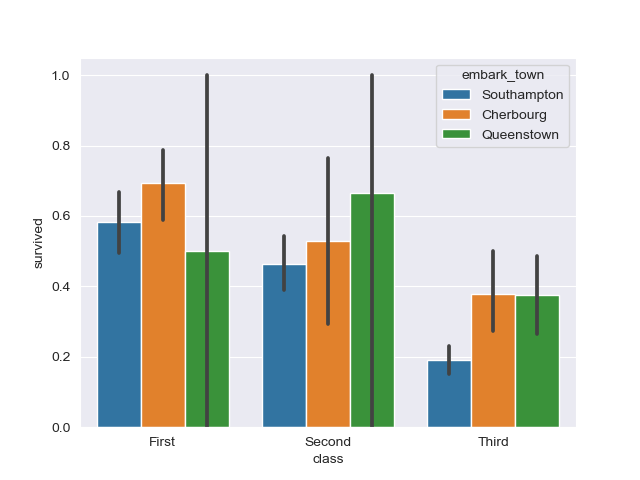
| Grouped Barplots | ||
|---|---|---|
| Seaborn barplot can display grouped barplots, where multiple bars are shown side by side for each category. Grouped barplots are useful for comparing the values of different variables within each category. The `hue` parameter in `barplot()` can be used to define the variable that determines the grouping. | ||
| 4 | ||
| Stacked Barplots | ||
|---|---|---|
| Seaborn barplot can also create stacked barplots, where the bars are stacked on top of each other for each category. Stacked barplots can be used to visualize the composition of a whole and the contribution of each category. The `hue` parameter in `barplot()` can be used to define the variable that determines the stacking. | ||
| 5 | ||

| Customizing Seaborn Barplot | ||
|---|---|---|
| Seaborn barplot offers various customization options to enhance the visual representation. The `palette` parameter can be used to define a color palette for the bars. Additional parameters such as `order`, `orient`, and `ax` can be used to modify the ordering, orientation, and axes of the plot. | ||
| 6 | ||
| Handling Missing Data | ||
|---|---|---|
| Seaborn barplot automatically handles missing data by excluding them from the plot. Missing values are represented by empty spaces in the plot. It is important to handle missing data appropriately before creating the barplot. | ||
| 7 | ||
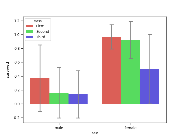
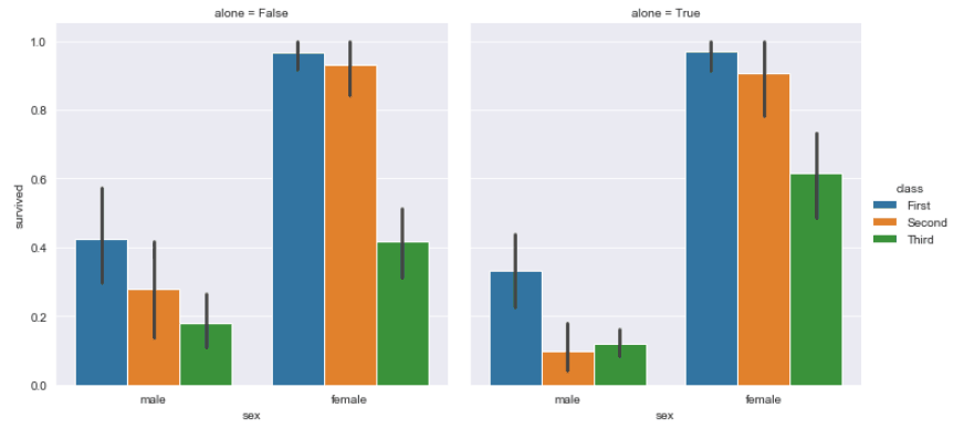
| Adding Error Bars | ||
|---|---|---|
| Error bars can be added to Seaborn barplots to represent the uncertainty or variability of the data. The `ci` parameter in `barplot()` can be used to specify the size of the confidence interval for the error bars. Error bars provide additional information about the variability of the data points. | ||
| 8 | ||

| Additional Features | ||
|---|---|---|
| Seaborn barplot provides additional features such as adding annotations to the bars using the `annotate()` function. It also supports categorical aggregation functions like counting the number of occurrences or computing the mean value for each category. These features can be used to provide more insights into the data being plotted. | ||
| 9 | ||
| Conclusion | ||
|---|---|---|
| Seaborn barplot is a powerful tool for visualizing categorical data in an informative and visually appealing manner. It allows for easy comparison between categories and can be customized to suit specific requirements. With its extensive range of features and customization options, Seaborn barplot is a valuable asset for data analysis and visualization. | ||
| 10 | ||