Excel Doughnut And Other Graphd Presentation
| Introduction to Excel Doughnut and Other Graphs | ||
|---|---|---|
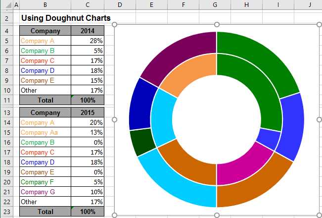
| Excel provides a variety of graphs, including the popular doughnut chart. Doughnut charts display data in a ring shape, making it easy to compare different categories within a dataset. Other graph types in Excel include bar graphs, line graphs, pie charts, and scatter plots. | ||
| 1 | ||
| Creating a Doughnut Chart in Excel | ||
|---|---|---|
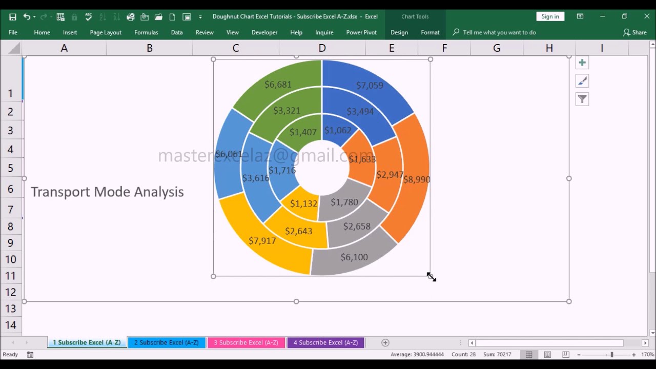
| To create a doughnut chart in Excel, select the data you want to graph. Go to the Insert tab, click on the Doughnut Chart icon in the Charts group. Excel will generate a default doughnut chart, which you can customize by adding labels, changing colors, and adjusting the size. | ||
| 2 | ||
| Advantages of Using Doughnut Charts | ||
|---|---|---|
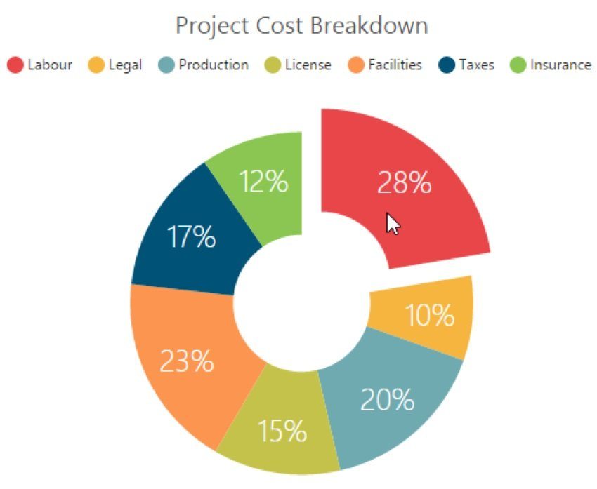
| Doughnut charts are effective for showing the breakdown of a whole into its individual parts. They allow for easy comparison of different categories within a dataset. Doughnut charts are visually appealing and can be used to present complex information in a simplified manner. | ||
| 3 | ||
| Other Graph Types in Excel | ||
|---|---|---|
| Bar graphs are useful for comparing data across different categories or time periods. Line graphs are ideal for showing trends and changes over time. Pie charts are great for illustrating proportions and percentages within a dataset. | ||
| 4 | ||
| Conclusion | ||
|---|---|---|
| Excel offers a wide range of graph types, including the versatile doughnut chart. Each graph type has its own advantages and should be chosen based on the specific data you want to present. By utilizing different graph types, you can effectively communicate your data and make it more visually appealing. | ||
| 5 | ||


